
To summarise this report, it can be said that accumulation of ETH has slowed down with investors now looking to HODL their positions without increasing their exposure. This may change if we see a big draw down in price, as many investors/retail are looking to buy the dip and we could see some panic selling. Long-term holders have not sold any sizeable amounts of their positions, with the majority of selling originating from short-term traders. The MVRV Ratio, would suggest that we are still in a Bull run and some distance away from a blow-off top. Blow-off tops are indicated by the MVRV surpassing 3.0.
Key Points:
- Investors have stopped accumulating and are now hodling, without adding to their positions.
- Long-term supply is still relatively inactive, indicating long term investors are staying in their positions.
- Short-term supply makes up most of the selling - day trading.
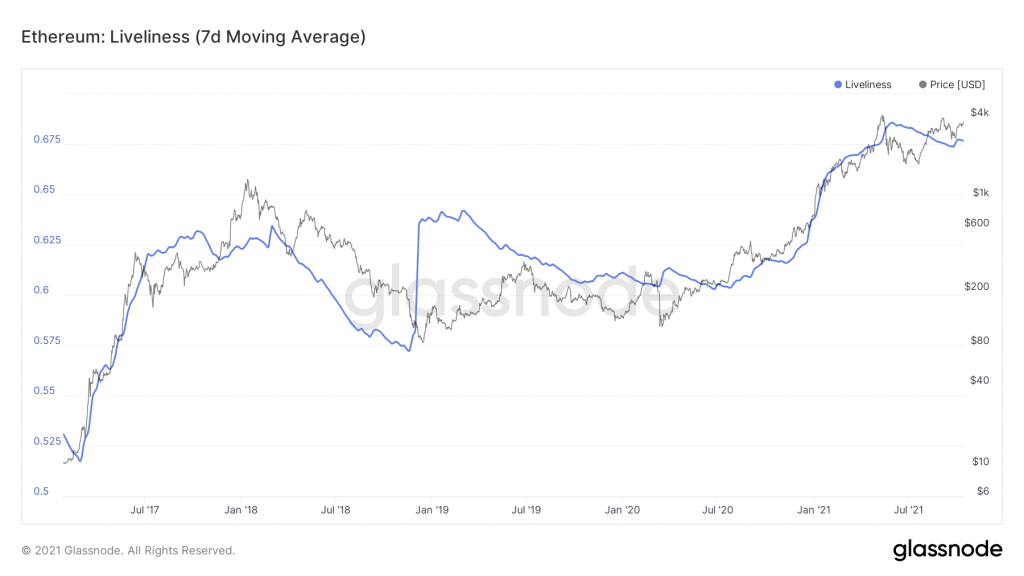
- Liveliness, reinforced that the mid-year lows led to accumulation by long term investors during this time. Such accumulation followed by resolute holding is indicative off the bull market continuing. It is the Year of the Ox afterall.
- The MVRV Ratio indicates that we are yet to have a blow-off top and we are still within 'fair value' prices for ETH.
Metric 1 – Exchange Net Position Change
In recent weeks the Exchange Net Position Change has reached an equilibrium between small green and red bars. Remember green indicates inflows of ETH into exchanges (to be sold) and red outflows (ETH from exchange to Metamask for DeFi/NFTs).
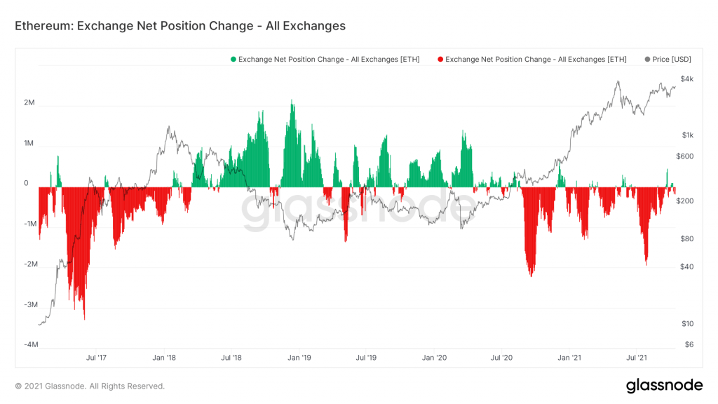
Since March 2020 you can see a consistent pattern. Small variations between green/red bars, and then significant red bars indicating accumulation. These periods off heavy accumulation are followed by a small selling spike. The red spikes are what drive price increases, as the available supply is decreased due to this accumulation. We saw this pattern play out on the leg up to 4,000USD. Another accumulation should follow with a potential ETF on the way. This will also show us if we remain in a bull market. Now let's have a look at those green bars, and see which investors have caused them.
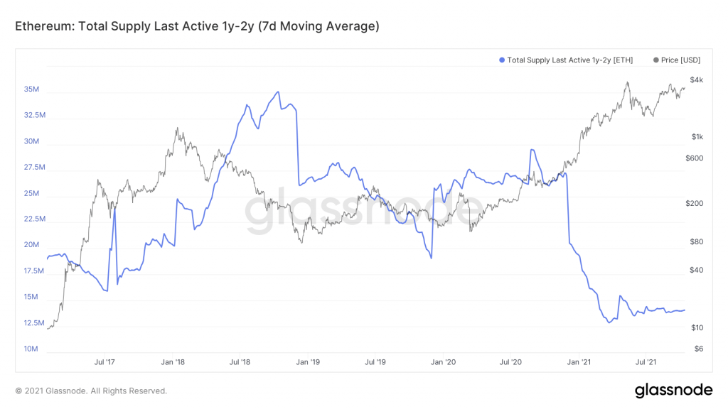
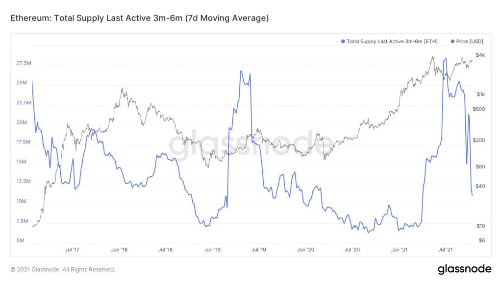
Metric 2 – Supply Last Active
Let's start off with our favourite investors, the long term ones. To do this we look at the supply which has last been active between 1-2 years. An increase in this metric indicates that long term investors are moving their ETH around. In very rare cases it might be to invest in NFTs or participate in DeFi, but 99% of the time this is to sell ETH. The metric remaining basically flat for the last 5 months indicates that long term investors are happy holding, and need to see higher prices to consider selling.
The short-term investors (3-6 Months) paint a different picture. They have been actively moving their ETH after the crash in May and the bottoming out period in late June saw the highest amount of Coin Supply movement from this cohort. This is data showing us that short term investors 'panic sell', and they do so after the dip. From the exchange net position we know that this selling was met by an accumulation. This is the transfer of ETH from 'paper hands' to 'diamond hands'.
Metric 3 – Liveliness
- Liveliness will decrease when a high proportion of coin supply is dormant (i.e. HODLing behaviour).
- Liveliness will increase when long term holders begin spending old coins.
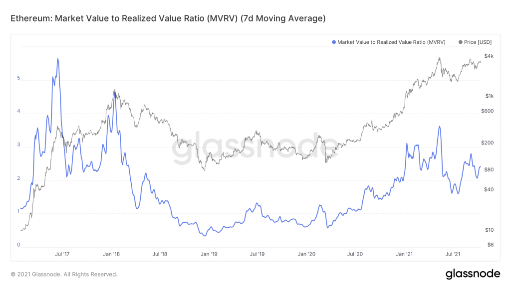
Metric 4 – MVRV Ratio
The MVRV Ratio is the ratio between market cap and realised cap. It gives an indication of when the traded price is below a 'fair value'. Currently the MVRV sits at 2.4. Values above 1.0 indicate a bull market, and when it is above 3.0 it indicates a blow-off top approaching. In a Bear market it's been as low as 0.5. The current value of 2.4 indicates that we are still some ways from a blow-off top approaching. Expect hodling until higher prices (which lead to a higher MVRV).
Recommended from Cryptonary